|
Whenever you see any form of media, it is likely that there is a team of editors, designers, photographers, and many more creative people behind the media. These people are directed by an art director. An art director is an individual that has worked within the design industry for many years who leads, inspires, and influences how the project develops. The role of an art director can mean different things in different organisations. According to James Fenton the founder of Blimp Creative “As an art director you must be a leader; someone who inspires and guides the vision of the design team.” According to Jenny Theolin “the main differentiation working as a graphic designer and as an art director was that I worked more with people than computers.” This clearly demonstrates that each art director has their own view on what their job entails. The skills that an art director must have been those on par with a managerial position alongside those for a creative role. For example, an art director must have good team working skills, have excellent communication skills alongside having excellent interpersonal skills. Therefore, this can allow them to be able to work on a design alongside a brief with other creative people to obtain results to be able to present this work to the client that has employed them. To be able to get into the role of art director you must have a master's degree in Fine Art or Business Administration. For my case study I decided to go for the Campaign created by Bodyform about #wombstories. This video was aimed to beat the stigma about sensitive topics regarding people with wombs. The sensitive topics can include sex, miscarriage, and many others. For the advertising, the colours that were included were typically used to imply women’s issues. So, therefore, they used the colours pink and purple, almost giving off a harmonious/monochromatic colour scheme. After researching more about the campaign, I realised that there was more to the reasoning behind the campaign. They wanted all people with wombs to feel included so therefore throughout their campaign they were using the words “people with wombs” to include transgender men, non-binary people, intersex people, and all people that have wombs. Therefore, this advertising really set off and paved the way for inclusion for all people, almost having a real leap forward for other companies to take note of and really follow.
The art director for this campaign would have had a huge role in trying to make the advert appeal to all people that have wombs and not just women. The art director would have also had a giant role in ensuring that the colours used would appeal to the audience. Alongside the Art director, there would have been a whole team of illustrators, designers, musicians, actors, videographers, and many other creative people to ensure that this campaign was effective for the target audience.
0 Comments
Here is a link to the stereotypes within advertising timeline that I have created.
For this project we were given the theme of Protest and Propaganda. I personally love subjects which you can go down different aspects of the theme, and this was definitely one of them. I personally went down the route of sexual assault/abuse/rape. I went down this avenue as it is something very close to my heart with many people that I know and myself having either been sexually assaulted/abused/raped.
When I was researching about the topic and current posters that have been used, I found that there wasn’t much on the topic. There were no pictures, it was pretty much just text and statistics. So therefore, I looked to current photographers which took portraits of people like Yousuf Karsh and George Hurrell, however they both were black and white portrait photographers, so therefore I wanted to use their methods, but add colour into the photographs. Now looking at the overall topic of colour theory, I actually never really thought about colour until it came to putting the photos and the text together. Then I was a bit freaked out because I hadn’t thought about the colour aspect. But after looking closely at the images I soon realised that I could make different colour schemes from the brief for example, monochromatic and harmonious colour schemes. Looking back at the project I should have done more research about the topic specifically and really look into different portrait photographers as this would have benefited my work greatly when actually piecing my work together. An opportunity which came up was doing posters based on completely different themes, I feel like this may have expanded my knowledge when doing my research, forcing me to broaden my horizon. However, I did find that due to personal circumstances that was going on at home. There wasn’t enough time for me to complete the project to the standard that I had wished for it to be. But, regardless, I am proud of the work that I have completed. My work changed completely through the project, initially I wanted to do three completely different ideas, but I stuck to the one because I thought that I would be able to perfect the one idea to an excellent standard. I had went from some more light-hearted material to I guess you would say more hard hitting imagery. I would say that I learnt that I needed to plan out my time to get everything done on time to an excellent standard. However, I actually learnt how to create a silhouette of a person as this was something that I had never done before, apart from when in a sunny landscape. I loved, being able to use photoshop for a different route as normally I would only use photoshop to edit my images, when I actually used photoshop this time for editing the photos, adding text, logos and really perfecting my final posters. When we did a group critique within the classroom, some things had been mentioned in relation to my posters with the first points for the silhouette poster being that the text is too far apart, change the text to a slightly grey colour, add a drop shadow and potentially change the font. I actually will 100% agree with these statements and this is something that I would not have noticed on my own back. The next points are for the “Don’t be BLIND to the signs of sexual abuse” poster, my peers stated that the “BLIND” should be in a different colour to allow the message to really come out of the poster. They also said that I should change the opacity for “HELP ME!” as then the help me would look more like the young child had written it himself. In addition, they mentioned the font again with it being an issue for the main text. They did not think that the font was the correct font for the subject. However, I disagree with this statement as I loved the font how it was. The last points were for the “After my dad sexually assaulted me I wish I was DEAD.” There was two points which came up with this poster with the one point being that the Samaritans in the bottom left should not be the logo but more like a #Samaritans, to allow the harmonious colour scheme to occur. The final point was about the grammar, but I still do not agree with the point. They said that the statement should be either “When my dad sexually assaulted me, I wished I was DEAD.” Or for the statement to be “After my dad sexually assaulted me, I wished I was DEAD.”. I still don’t agree with this but some things you can never agree on. Whilst creating the posters, I had to bear in mind the regulations set out by the Advertising Standards Authority. Below is a button to the ASA.   Advertising has developed significantly, to adapt to current societal norms and standard morals within the time of publishment. These advertisements help to change and develop individuals own beliefs. Which can have a negative impact on society by either causing offence to groups of people or painting ideals in consumers' minds which can affect societies' psychological wellbeing. This means that advertising companies have a responsibility of giving out valid and accurate information to prevent harm to consumers.
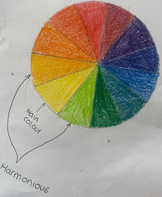
Racism, sexism and homophobia have occurred within advertising before the 1950’s. With racism and sexism being primarily the focus within adverts, to appeal to certain target audiences. In 1875, Fairy Soap released an advertisement to develop the sales of their product. At the time of publishment there were no regulations with what they could or could not make. When the advertisement was published, racism towards black people would have been considered the “norm” and society would have not seen it as racism as we know it today. But, looking at the advert in 2021, it is explicitly racist. The advert itself shows a young white girl asking a young black girl “WHY DOESN’T YOUR MAMMA WASH YOU WITH FAIRY SOAP?” This then implies that the young black girl is dirty. Also, with the young white girl being in a dress and shoes, and the young black girl dressed in rags and no shoes implies that the white girl is superior to the black girl. Which today, would not be allowed for multiple reasons, with one being society’s morals and the other being the rules and regulations set for advertising companies which adverts must follow to protect the public from harm. In addition, the advert could be seen as sexist in 2021, but at the time of publishment, it was considered the norm with mother’s being the “housewife” and men being the workers within the household. It appears to be quite domestic with young girls being advertised instead of young boys. The advert itself was in colour with half of the advert being an illustration that was realistic and the other half being text. This is presumably used within a newspaper. The colours within the advert are a harmonious colour scheme. Later in 2011, racism and sexism has decreased significantly due to societal norms and beliefs. The advertisement in 2011 shows three women in towels after having showered using Dove soap. They have tried to show within the advert that their consumers' skin before will be dry and afterwards it will be smooth. But whilst doing so, it has some racism embedded into it without the company even knowing that it is racist. The women's complexions range from darker to lighter skin going from left to right. This implies to a viewer that the black woman is dry and dirty because she has not used the Dove soap, in comparison to the white woman that has used the soap and is clean and soft. The text within the advert states “Visibly more beautiful skin from the most unexpected of places – your shower.” this could help to form an idea into a consumer's mind that the black woman is not beautiful, and the white woman is. During the time of publishment, there was clear guidance and regulations about advertising. So therefore, it is quite unusual for this to happen, Dove had some backlash from viewers about their advertisement. This was due to the overall racist feel to the advert. Dove had upset the black and ethnic minority groups with this advert causing the advert to be cancelled. Overall, advertising has changed throughout the years with the regulations and guidance about advertising not allowing certain discriminatory advertising to take place. However, this does not mean that some adverts can be missed. Which is evident with the 2011 advert. Despite this, the advertising regulations have been able to keep track of discriminatory advertising and adverts that are discriminatory are not released to the public anymore due to the offence caused to certain groups of people. For this assignment brief, we had to create 3 posters based on the theme of "Protest & Propaganda" which we had to ensure that there was a colour scheme for each poster with one being complimentary, one being harmonious and the other being monochromatic. Initially, it seemed quite overwhelming for me. The whole world of subjects came flowing and this was where I struggled at first putting all of my ideas down onto paper. I therefore put all of my ideas onto a mindmap where I could then choose what theme I wanted the posters to be about.  Then when looking at all of my ideas, I found that one was really poking out and hitting a nerve to me so I thought that I should choose that one. Which was sexual assault. I then found it helpful to start a mindmap of all of my ideas for the theme and just start writing them down.  Mood board:  Idea 1 For my first idea I thought that men sexual assault isn't talked about so I thought that I could shed some light when it comes to incestual sexual assault. Which occurs more than you would think. I wanted the poster to be impacting for a viewer. For it to be able to tell a story without it being to explicit. Which I feel like the poster does that. I also was thinking about it having a charity to back up the poster. So I think that Samaritans would work with the theme of the poster. With the posters having a clear message about suicide. Idea 2 For my second idea I wanted to have an insight into child sexual abuse. With this being such a sensitive topic I had to really think about hiding a child's identity so there was no backlash in the future for the child and the child's family. I wanted this image to be powerful. I wanted it to shock a viewer when they see the poster. Idea 3 For my third and final idea I wanted to continue the idea of sexual assault/rape amongst men. I needed this to be more subtle due to the other two ideas being more impacting. I wanted this one to have the same powerful messages but for it to be more subtle so therefore it would be more applicable for young people to view the poster as well. First Idea Mock-up After doing the first mock up for my first idea, there was some things which I never took into consideration like the colour theme and how I could personally take the photographs to then reflect my own ideas. Second Idea Mock-up After doing this mock up I hadn't thought about how you can't take photos of children for sensitive topics due to the potential after effects for families. I also never took into account of the colour theme for the poster. Third Idea Mock-up Then for this mock up I then decided to take the photo myself. I had took into account the colour theme but I don't think that it worked how I wanted it to be. Posters   Different colours are used within advertisements to give different effects to a viewer, these sets of rules are detrimental to understanding how companies use colours to portray different messages to a viewer. The colour wheel The colour wheel was first invented by Sir Isaac Newton in the 1700's. This was created after he had discovered the spectrum of light that was the first spectrum that is visible to the human eye. When Newton had discovered the colour wheel, it was believed that colour was developed after mixing light and dark colours (Red and blue). Newton soon realised that this theory was incorrect. When he had contracted the plague, he soon started to test the white light properties. After testing, using the prism experiment, he soon found that the white light was made up of multiple colours. He started to put them into a visual diagram, which allowed him to then further experiment and find out that by mixing the primary colours, he could find another set of colours. At this time, this discovery would have been quite revolutionary. Primary Colours Primary colours are the colours that you can not create from any other colour. The three primary colours are red, yellow and blue. Secondary Colours Secondary colours are the colours that are created by mixing two of the primary colours. The three secondary colours are purple, green and orange. Tertiary Colours Tertiary colours are the colours that are created by mixing the secondary colours. These can be various different colours and are almost infinite. 


Colour PsychologyBelow is what emotions/experiences relate with each colour. Power, royalty, luxury, calming and strength Stability, wisdom, confidence, calming and trust Health, harmony, nature, refreshing and calming. Energetic, happiness, attention and joy Heat, success, creativity, warmth and excitement Passion, strength, love, determination, power, anger, excitement and intensity Sterile, cleanliness, cold, unfriendly, innocence and spacious. Power, elegance, evil, death, confident, stable and mysterious. We then had a lesson with a student teacher Sam, where we really learnt about what emotions and experiences we associate with each colour. I actually learnt that what experience that I had with a colour, is very different with what someone else experiences with colour. For example, I found that I really resonated with the colour yellow. But for a different way from everyone else. Yellow represents for me innocence and love. But for other people it can represent joy and excitement. This really has stuck with me. During the lesson we were asked our opinion on three pieces of art and how it makes me feel about the piece of art. The first art piece that Sam showed us is the one below.  Mark Rothko Mark Rothko This was a painting made by Mark Rothko. For this first piece of art my immediate thought was that it appeared to be like the moon, then after further analysing it I realised that the colours black and white mean separate things with white implying purity and black implying death. This may not have been the reason as to why Rothko had created this painting but it really could imply all about how when you die you then become pure. Or that you are pure until you die.  Yves Klein Yves Klein To most of my peers the blue painting didn't actually resignate with them. But for me, blue was such a colour which implies sadness, but for me the blue colour deeply reminds me of all of the struggles that I have faced and how I have overcome them and became myself despite all of the horrible things that have occurred to me.  Yayoi Kusama Yayoi Kusama This reminded me of mushrooms and really childhood. But it reminds me of a happy childhood and being free like a child is without any worries. Also with the red and white almost reminds me of candy canes which remind me of Christmas and what age loves Christmas is children. Historical Associations of colourPink The colour pink was first originated in France where the French aristocracy had been painted with pink cheeks. But at this time the colour pink was worn by both men and women which later changed. Pink was seen to be a more masculine colour due to it being a lighter shade of red. After the 1950's the colour pink was taken from boys and men started to wear darker colours. Which brings us to today's society, in todays society pink is seen as feminine. Blue The colour blue was first depicted when humans were able to make blue pigments. In the times when there were cavemen, there was no blue colour due to the lack of materials. The Catholic Church made an important stride towards the colour blue where Mary was wearing a blue coloured robe to imply innocence and trustworthiness. Which could be the reason as to why police around the world wear blue to allow them to convey a message of trustworthiness. Orange The colour orange was originated in before the 15th century, where the colour orange was called yellow-red. It was only since the Portuguese bought some orange trees from Asia, which became "naranja" in Spanish and "laranja" in Portuguese. The first use of the word orange in accordance to the colour was first used in the 16th century. Purple The colour purple was first originated after the colour had to be made artificially by crushing a large amount of sea snails to get a tiny amount of purple. Therefore, this costed a lot of money which allows the colour purple to be recognised as wealthy. The most obvious evidence of purple in history was when the British Monarchs wore purple as they were some of the only people in the world that could afford the colour purple. Green Green was an interesting colour to research about. I found that green in the 17th century was manufactured for wallpaper, which soon was found to have high levels of arsnic which was toxic to people. However, green has been used in art since the Ancient Egyptians. ReferencesBudrick, C., 2021. A Brief History of the Color Wheel. [online] PRINT Magazine. Available at: <https://www.printmag.com/color-design/brief-history-color-wheel/> [Accessed 5 November 2021]. Colour Lovers. 2008. History of The Color Wheel. [online] Available at: <https://www.colourlovers.com/blog/2008/05/08/history-of-the-color-wheel> [Accessed 5 November 2021]. Dean, M., n.d. Become an exceptional designer. Smashwords. Evans, G., n.d. The Story of Colour: An Exploration of the Hidden Messages of the Spectrum. Michael O'Mara. Gage, J., 1993. Colour and Abstraction. London: Thames and Hudson. Koontz, A., 2021. A History of Color. [online] Caltechletters.org. Available at: <https://caltechletters.org/science/history-of-color-1> [Accessed 5 November 2021]. Nast, C., 2021. How to Pull Off a Monochromatic Room. [online] Architectural Digest. Available at: <https://www.architecturaldigest.com/story/monochromatic-room-design-tips> [Accessed 5 November 2021]. YouTube, I., 2021. Complementary Color Scheme Examples from the Color Wheel. [online] interiordezine.com. Available at: <https://www.interiordezine.com/color/complementary/> [Accessed 5 November 2021]. |