|
Colour Gels are sheets of a transparent coloured material that can be used within photography, film, theaters and many more. Generally, colour gels are made up of polycarbonate or polyester. The colour gels are used to portray different feelings to an image, for example, blue is generally used to portray a sadness and red is used to create anger or love. More about the psychology behind colours are in my Colour Theory blog post. After reading a Sway made by my tutor Emma. (Jukes, n.d.) It was then time for me to have a look at some potential ideas that I would have liked to create for my colour gels. So, I put together a Pinterest board of images that I liked and would want to either recreate or use some ideas from. In my previous studies, I have witnessed other students use colour gels for their images. Also the link for my Pinterest board is here. 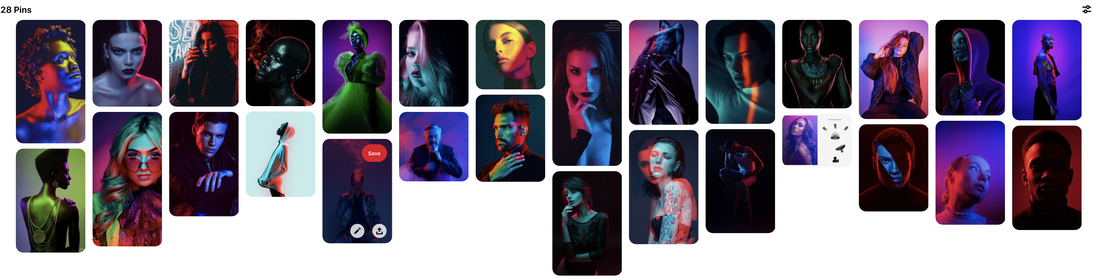 Now, it was time to actually go into the studio and essentially play with the type of photography. Whilst keeping in mind colour theory. So, firstly we went to the red backdrop side and tried to play around with complimentary colours and harmonious colours. Below is a lighting diagram of how the set up for the colour gels was.  After being shown how to use the colour gels to display certain feels to a photograph, it was now time for us as a small group to have a go at a shoot. I followed all health and safety practices and this is therefore shown within my health and safety risk assessment.
Shown below is my contact sheet for my shoot. Then it was time to edit the pictures that were taken. One mistake that I did notice was that the images were taken in a JPEG format meaning that not a lot of editing could actually take place. Which is something that I needed to be aware of when editing. When composing the images, I had to really think about what part of the colour theory I wanted the image to be of. For example, the top two images are monochromatic and the bottom image was a tetradic colour scheme. Personally, I feel like I prefer the tetradic colour scheme more than the monochromatic colour scheme. Conclusion If I am completely honest, I don't like this colour gel shoot. I don't think that it was a very good shoot. I don't know whether the colours complimented each other within the photos. Especially with the two pinky/purple colours. The last picture, has a different feel to the photo in comparison to the others. The top two images I like the exposure on, But the bottom image, could have been exposed more. But, again if I wanted to create a halloween feel to the image, it would have been a perfect exposure. If I am completely honest again, I should have looked at the exposure at the time when I took the image and increased the aperture to increased the exposure within the image. But again, if it was a halloween feel to the image, the exposure would have been perfect. ReshootAfter looking at my final work, I decided to do another shoot. This shoot came out like this:      I think this shoot was significantly better. I think the colours complimented each other a lot more than the original shoot.
0 Comments
Leave a Reply. |
|||


